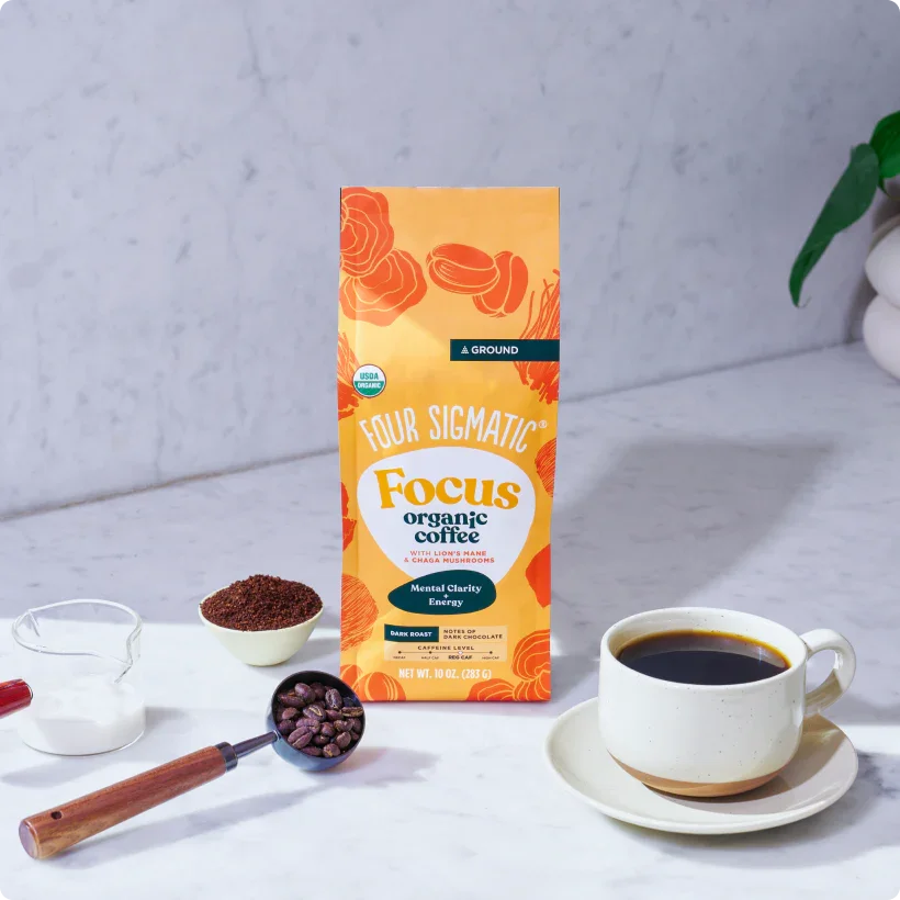
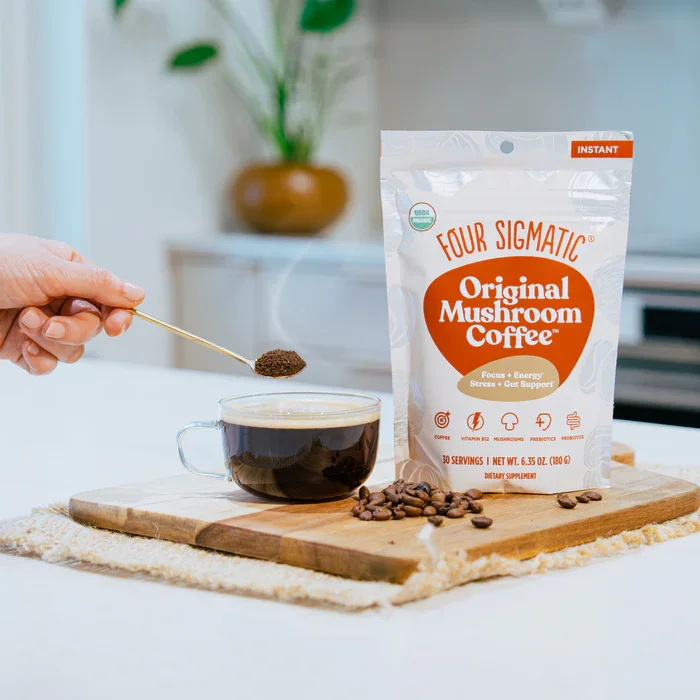
Four Sigmatic
Smart coffee
made simple
Clear benefits. Easy choice.
From curiosity to cart

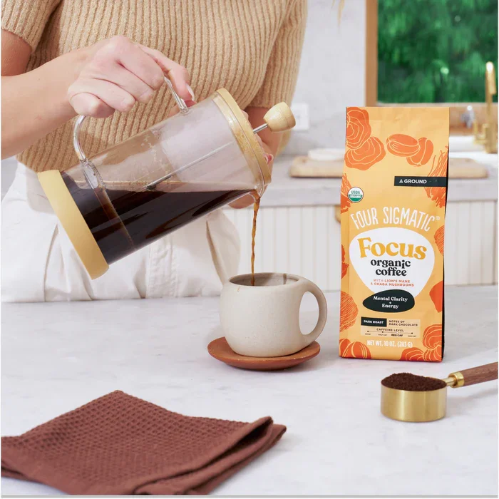
Four Sigmatic’s site is clear and engaging, with sharp microcopy that pulls readers in. Their social and blog content is visual, fun, and easy to connect with. Even the opt-in experience feels intentional, thanking subscribers right on the site while SMS delivers instantly.
The challenge appears after signing up. The opt-in and SMS create a strong start, but only one welcome email follows before the flow ends. When the follow-up stops, so does momentum. The design feels unfinished, and engagement naturally tapers off without clear next steps. The email also lacks a confirmation button, even though the subject asks for one. Across channels, strong individual pieces exist—but they aren’t yet connected in a way that keeps the customer moving forward.
This project was built to change that. It adds post-welcome nurture emails supported by one SEO blog and two social posts, each designed to lead the audience smoothly from one touchpoint to the next. The result is a cohesive experience that connects curiosity to purchase—and keeps the conversation going long after that first click.